Doughnum

alt
  • Product Design
  • Product Strategy

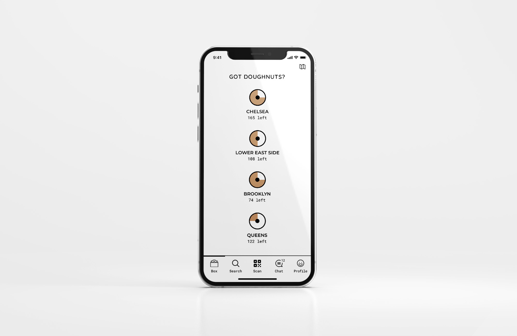
An online doughnut reservation tool that displays real-time counts of available doughnuts at every store location.

Too many times, the doughnuts I wanted to buy ran out as soon as I arrived at a Doughnut Plant shop. I would either leave empty-handed or settle for doughnuts I wasn't satisfied with.

Doughnum began as my graduate school project in 2013, undergoing a UI refresh in 2016. Although I reached out to Doughnut Plant about the idea, I unfortunately didn't receive a response at that time.

As of 2021, you can now order doughnuts online directly from Doughnut Plant's website.

Key Responsibilities

  • Identify a business potential.
  • Lead product design and usability testing.
Key Screens

Design Process

1. Research
  • Identify pain points
  • Business due dilligence
2. Ideate
  • Define a product strategy
  • Create user flows
  • Explore the UI design
  • Wireframe development
3. Prototype & Test
  • Wireframe prototype
  • Hi-fi prototype
  • Usability testing
4. Finalize
  • Design revisions
  • Reflections

1. Research

Participant Observation
As a customer myself, I was able to experience the pain points of buying doughnuts firsthand. Additionally, my frequent visits to various store locations provided valuable opportunities for user observation, allowing me to be in the same environment as other users.

Key Pain Point
The inability to purchase desired doughnuts due to them being sold out by the time customers arrive at the store.

Doughnut Plant's Business (2013)
I conducted an audit of Doughnut Plant's website to gain insight into its business, including its value proposition, competitive advantage, and brand identity.

Doughnut Plant is a cake doughnut franchise primarily operating in NYC, with locations in the Lower East Side, Chelsea, Brooklyn, and Queens. It offers a variety of distinctive flavors and colorful designs. The pick-up service is available for orders of three dozen doughnuts or more, with a 48-hour reservation requirement. The website features a list of available doughnuts and location addresses. The casual brand identity appeals to millennials and Gen Z.

Persona & User Journey

2. Ideate

What caused the pain point was the limited availability of doughnuts at each store. Users should have the ability to check doughnut availability beforehand and reserve them. The best way to inform them was to be in close proximity and provide prompt notifications.

A mobile application seemed to be the optimal solution since the majority of the target group carried smartphones. It should feature two main functionalities: doughnut counts and doughnut reservations. This idea could serve as a differentiator for Doughnut Plant, especially considering that the concept of ordering food online was still relatively new in 2013.

Doughnut Plant's brand identity was highly distinctive, characterized by strong typography and vibrant colors. I based the UI design of the mobile application on their website to maintain brand consistency. Current customers would feel instantly familiar with the interface, while new customers would easily recognize the brand.

User Flow

3. Prototype & Test

A wireframe prototype was initially created to test the core user experience. Feedback from this stage was then incorporated into a high-fidelity prototype to evaluate the user interface and overall experience.

I conducted testing with seven users, and the feedback was generally positive.

  • One comment that prompted significant changes was the suggestion to increase the number of doughnuts displayed on both the landing screen and the store screen.
  • Users were accustomed to seeing all doughnuts at once in a physical store and desired a similar experience in the app.
  • Additionally, many users suggested removing the doughnut names, as they found it easier to remember the appearance of the doughnut rather than its name.

4. Finalize

The user feedback was incorporated into the final design, which was tested with users again as a wrap-up. Overall, everyone reacted with joy to the idea of having a doughnut reservation app. The user experience was intuitive and delightful.

Reflections

  • Start with a user's pain point, direct with a strategy, and deliver through the craft of design.
  • An idea conceived today may remain relevant in the future.
  • There is always room for improvement in your old designs.